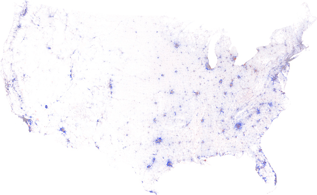
[Above] is the contiguous United States, color-coded by the change in population density from 2000 to 2010. In urban areas, deep blue indicates that the population doubled (or more), pure red means that everyone left, grey denotes no change, and the intermediate tones represent the spectrum of increases and decreases in-between. Below 5000 residents per square mile, these colors fade with the square root of density towards white, where no people lived in either year. We created these maps from the official U.S. Census 2000 and 2010 block-level population data and boundaries using custom-built cartographic software.
This post made the rounds a few weeks ago. I just noticed (thanks to Aaron Renn) that the cartographer has since published more metro maps. Of greater interest to me is the one of Pittsburgh. Do click on the link to see the map. It is too big to paste here for reference purposes. Compare the urban core population growth with other cities.
No comments:
Post a Comment